Thursday, 26 November 2009

SWOT Analysis

Strengths:


One strength I have is that I am a multimedia student and I have already have knowledge and understanding of how to take an idea and make it into a design. I have a very create side to me and I’ve always wanted to use it to explore my potential. I also have the added benefit of being a student and having access to the equipment and help from lecturers in the university. Another strength I have is that I have access to many tutorials and information on 3Ds Max through use of the university services and through the use of the internet. The website, www.youtube.com, allow everybody access to many tutorials from other individuals who have used the program before.


Weaknesses:


One of my biggest weaknesses is that I have a time scale on this work which means that I have to have all the stamps done by a certain time. This means I may need to rush at times and my work may not be at a high standard and to its full potential. Another weakness is that I have never used this program before so I have had to learn many aspects and features before I have been able to do the simplest of tasks. I also am highly likely to make a mistake in the program if I have never used it before because I am not used to all the shortcuts that are available and how to undo a mistake without using the undo feature. I also have a huge lack of patience with the program because there are many mistakes that can easily be made and also the lack of confidence with using the program means I am scared of exploring its full potential to see what I can do in it.


Opportunities:


There are many opportunities available to me by doing this module. One of the biggest opportunities is to be able to learn a new program. I have always wanted to expand my knowledge of the different programs I can use to design and create. I think that 3Ds Max will educate me on many other ways I can create and manipulate an image using a computer. As I am a multimedia student, I am studying many different aspects of designing and creating. My course mainly focuses on producing video, sound and websites. By doing this I have the opportunity to study a different aspect of design and I have found it is a pathway I thoroughly enjoy and would like to be involved in in the future. Another opportunity available to me is that I will be able to put my work from this module in a portfolio for the future so I can show employers in the future what I am capable of.


Threats:


There are many threats in my work and a few I have already experienced. I was making the fish and I lost patience with the program because I touched a shortcut I wasn’t meant to and I couldn’t understand what I had done wrong. This was due to lack of experience and confidence in the program. I panicked and immediately closed down the program without saving and lost about 2 hours worth of work. I do not want this to happen in the future when I am at the finishing point of my project. Another threat is losing my work through a virus or lost USB stick. This happens very often with other students and I try to be careful and make back-ups as often as possible. Another threat is not being able to complete the work within the time scale given to me. I have a deadline date and it would be very unfortunate to not make that deadline. Also, because I have the deadline I am likely to rush my work because I also have lots of work to do for other modules as well. This means the work may not be up to a high standard. Another very likely threat is that I might become ill between now and the deadline and lose more time being able to complete the project.

Tutorial - Shadows and Lighting


Through tutorials I learnt many different ways I can use and manipulate lights and shadows to make something look more effective or realistic as a 3D shape. I was firstly I created the shapes and placed them on a plane. Then I used 'target spot' and 'omni' to create different lights and use them to create shadows.


I then used these techniques to create a a candlelit pumpkin. I gave the plane it is sitting on a texture to make it look more relistic and i gave the spotlight a smokey effect to make it seem like its in a spooky atmosphere. The pumpkin was also given a texture to make it look more realistic. I did this by putting a texture looking picture on the bump option in the material editor. My finished pumpkin is shown below.

My Third Stamp Idea


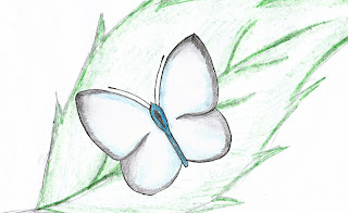
This is my third idea for a stamp. This idea is not based around camouflage because I wanted to be able to use more skills and see if i could show biodiversity in a different way. I have always had a passion for butterflies because their grace and elegance can almost make someone feel relaxed just by looking at them. They have a very peaceful nature and remind me of a summer feeling. When looking at a butterfly it can remind many people of their child-like nature. I will create the butterfly as a 3D shape and put a texture onto the butterflies wings to make it seem real and give it some amazing colours. I will also recreate the leaf i made in the tutorial so that the butterfly has something to rest on.

My Second Stamp Idea


This is my second stamp idea. I wanted to base my designs around the theme of camouflage and after looking into many different ways I could camouflage an animal I found that many animals have similar colour and textures of skin or fur. I wanted to incorporate this into one of my stamps so I created the idea of a panda being camouflaged by zebra skin. I think it will look very interesting to see a panda with the skin of a zebra. I will create the panda's head as a 3D Shape and then use the material editor to add a texture to it. I will also put the zebra skin texture in the background to camouflage the panda's face.

My First Stamp Idea


This is the design of my first stamp idea. In my head it was more impressive than it looks now. The idea was based around sea life and camouflage. I wanted to create a fish but i didn't just want to show just a fish on its oen so I decided to show a fish camouflaged by its habitat which is a coral reef. I find the texture and colours of the coral reef amazing and want to show that on the fishes scales. The fish will be created as a 3D shape and then I can use the techniques I learnt from using the material editor to create a coral texture.

Monday, 23 November 2009

BBC "Life"

I watched the BBC programme, "Life" which was on TV and available on the BBC iPlayer and I was surprisingly hooked on it within seconds, naturally I was 'catching flies' and some of the video captured of animals and insects in their natural habitat was breath taking. One of the episodes which really caught my eye was the "Fish" episode which featured many different sea creatures. I found the species and colours fascinating. The coral reefs were startling and the textures of the reef were amazing. This inspired me so much for some of my ideas. I want to base one of my ideas around sea creatures because I think people would be interested in seeing something fascinating like a coral reef on a stamp.

Thursday, 19 November 2009

Tutorial - Mapping Techniques


I created the leaf using mapping techniques by changing the material to make the texture look more realistic. I was very pleased with the outcome of this leaf because it looked surprisingly realistic which I didn't think was possible in this program. I've learnt new techniques and learnt more about the tools and what I am capable of doing with them using 3Ds Max. Being able to change the material of an object will come in very useful and has given me many ideas of what I could create for a stamp. I also learnt how to change the shape of an object using the 'edit poly' tool. This technique will also come in useful when creating my stamp because it will enable me to shape objects to form particular animals or plants etc.


The picture above shows the leaf I created from the perception it was made in 3DS Max. By using the 'edit poly' tool under the modifier menu, I was able to created the 3D effect by moving particular points on the leaf around to make bend and look more realistic.


The leaf texture was made to look realistic by using the material editor and by using a picture of a leaf. The picture was 'diffused' onto the 3D leaf and the bump option was used to give the leaf a rough texture.

Thursday, 5 November 2009

My Third Mood Board


This was my final idea for the biodiversity stamp. I made the mood board around the idea of camouflage. Every animal and species has a particular texture, colour or pattern which makes them recognisable; however, many animals use their colours and textures to hide and hunt for their food. They do this by sometimes changing their colour or naturally evolving over time to suit their habitats for survival needs. Many animals also unintentionally have the same texture or colour as other animals. For example, a panda has the same colour furr as a zebra's skin. Also, many animals in a group can look like other animals, for example, in the mood board there is a piture of a bunch of zebras which create the shape of a lion's face.

My Second Mood Board


This is my second mood board idea which is based around ideas for the biodivesity stamp. This mood board focuses on the idea of weird and unusual animals and creatures. I like this idea because during my stamp research I found that many stamps contained rare and unusual animals and species. I thought this would be a good stamp to produce as people find unusual animals interesting and eye catching.

My First Mood Board


This is my first mood board which shows my first idea for a stamp. It focuses around the idea of one animal made up of two separate species. For example, a camel with a squiral's head, or a rhino with zebra's stripes. I like this idea because it shows that every animal has different, recognisable characteristics and that each animal is individual and different. So that when one animal is mixed with another, it is highly noticable. It also shows that some species have very similar characteristics. For example, a horse and a zebra have the same body shape so they have a similiar characteristic.

Wednesday, 4 November 2009

Stamp Research


After finding out that I had to create stamps around the theme of biodiversity I researched into the types of stamps that are currently available around this subject to give me ideas and inspiration as to what I can base the ideas of my stamps on. I looked into many different stamps from different countries. The picture above shows some of the stamps I looked at. I found that many of the stamps that show animals are based around rare or unusual animals. Stamps showing average, well-known, animals, such as cats, dogs, cows etc are very rare. Stamps mainly show rare or exotic animals and insects. Stamps that focus around plants are also very similar. Only rare or strange plants are shown. I think that the reason for this is to catch people's eye. People would not be amazed by average, well-known, animals or plants. From this I have learnt that, in order to make my 3D image look like it belongs on a stamp, I have to make the image look interesting and unusual.

Tutorial - Lofting


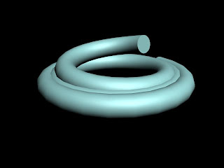
The image shown above was the first 3D image I create using the lofting tool. This image did not come out as I expected because I made the cross section too big. This made each layer of the coil integrate which was not expected. So I made another attempt at using the lofting tool which is shown below.


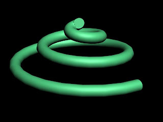
I created this by using two simple shapes. Firstly I created a helix to create the basic shape of the swirling coil and made it into the shape and size I was happy with. I then changed the parameters of the helix to a bias of -0.5 and the number of turns to 3 or 4. From this I had the basic shape of the helix and all I needed to do was create a cross section to make the shape bolder and appear in 3D. I drew a small circle which represented the boldness that the swirl was going to appear. I then selected the lofting tool from the geometry section and selected 'Get Shape' and clicked on the shape to make it look appear bolder and in 3D as shown below.

Tuesday, 3 November 2009

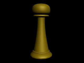
Tutorial - Using Lathe Modifier to create a chess piece

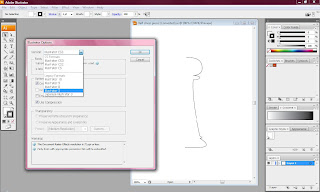
Firstly I had to create half a chess piece using the pen tool in Adobe Illustrator. I made sure that both ends of the chess piece drawing were vertically in line with each other. I then saved the image as the oldest version of Adobe Illustrator to make sure it was compatable with 3DS Max. This is shown in the image below.


After I imported the image into 3DS Max, I was able to use the Lathe Modifier tool and use the shape (below) to create a cross section through the central point to create a symetrical 3D shape. I choose my pivot point which was at the top of the shape directly on the edge of the line.


After I had used the lathe modifier tool I
had to select 'Flip Normals' to make sure that the polygons face outwards to show the shape.


This is the rendered image (shown below) that i create using the lathe modifier tool.