At the start of this module I was not very confident with using this program. I was nervous about even touching the keyboard during the production of anything because, as I've found out through unfortunate events, most of the keys are shortcuts for zooming, changing camera views, taken away icons etc. I found this very annoying and this held me back quite a lot during this module because I couldn't find what I had done wrong until I could go back into a tutorial. I found the program had too many options, a lot of which were hidden behind buttons and tabs. I got very frustrated with the program. However, as time went on I found a great liking for the program and found that it enabled me to do many things I was never able to do before. I am very glad I learnt how to use 3DS Max because ti has allowed me to learn many new skills and find out about many different ways I can create and manipulate an image or a 3D object.
I was very surprised at how easy I picked up the ability to make object through creating the stamps. I had barely done 4/5 tutorials before I started one of my stamps. I admit I was very uncomfortable with using the program at first but I picked it up pretty quick and soon enough I was thoroughly enjoying making the stamps.
Thursday, 10 December 2009
Final Stamps
The Butterfly Stamp
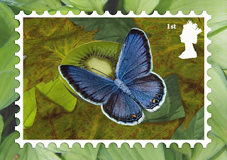
This stamp is my personal favourite because I love butterflies. I found this stamp very easy to do because I started this stamp last, therefore I knew many techniques from tutorials and the other stamps. I am happy with the way this stamp turned out because I like the way the butterfly looks and how it stands out against a natural background.
The Fish Stamp
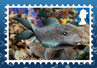
This stamp was very difficult to do as I started this one first and finished it last. It took me a very long time to do and I got very frustrated with it. Because I started this one first I was not very familiar with all the tools and what I was capable of doing in the program. The shape of the fish took a very long time to create. I am happy with the way it turned out because of all the time and effort I spent on it.
The Panda/Zebra Stamp
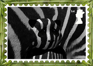
This was one of the easiest stamps to produce because it started as a simple round circle and progressed from there. Because I saw progression straight away I found that I was happy with how I was getting along and wanted to do more to improve on it. I am impressed with how this stamp turned out. I didn't think this stamp would look this good.
This stamp is my personal favourite because I love butterflies. I found this stamp very easy to do because I started this stamp last, therefore I knew many techniques from tutorials and the other stamps. I am happy with the way this stamp turned out because I like the way the butterfly looks and how it stands out against a natural background.

The Fish Stamp
This stamp was very difficult to do as I started this one first and finished it last. It took me a very long time to do and I got very frustrated with it. Because I started this one first I was not very familiar with all the tools and what I was capable of doing in the program. The shape of the fish took a very long time to create. I am happy with the way it turned out because of all the time and effort I spent on it.

The Panda/Zebra Stamp
This was one of the easiest stamps to produce because it started as a simple round circle and progressed from there. Because I saw progression straight away I found that I was happy with how I was getting along and wanted to do more to improve on it. I am impressed with how this stamp turned out. I didn't think this stamp would look this good.

The Butterfly - Final Images
The Panda/Zebra - Final Images
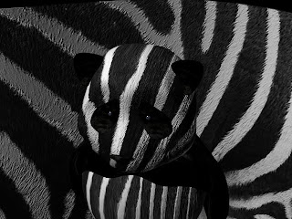
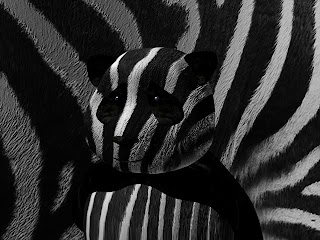
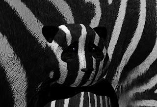
These are the final images for the Panda/Zebra. I am very impressed with the way these turned out. I thought it would be very difficult to achieve the camouflage look and therefore I thought that the images would not look very good. I have decided to use the last image for the stamp as it has the best view point.


The Fish - Final Images
The Fish - Part 5
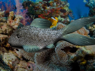
The fish is nearly finished. I have just added some finishing touches to it. I wanted to put the fish in its habitat.
I created a plane and used the material editor tool to add a picture of a colour coral reef. I adjusted the picture to make sure that it fit nicely behind the fish to give the fish a perfect background.

The picture below is the rendered image of the background. I wanted to see how it would look after it had been rendered.
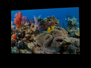
I then put the background and the fish together and positioned them well to create the final view before I rendered for the final time.
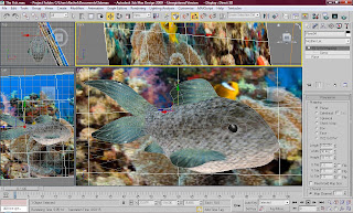
I created a plane and used the material editor tool to add a picture of a colour coral reef. I adjusted the picture to make sure that it fit nicely behind the fish to give the fish a perfect background.

The picture below is the rendered image of the background. I wanted to see how it would look after it had been rendered.

I then put the background and the fish together and positioned them well to create the final view before I rendered for the final time.

The Panda/Zebra - Part 4
After I thought I had completed the fish I looked at the image and thought there was something missing. I didn't like the way the panda's head looked like it was floating, so i decided to create the panda's body.
The body was very hard to create. I had to make sure that it looked very similar to the way a panda is shaped. I created the main part of the body with a simple sphere and some texture using the material editor. The arms and shoulders were not so easy because they did not have a basic shape to them. I made one arm using a cylinder and the 'edit poly' modifier. I also used the 'soft selection' tool to make sure that they looked even. After I had spent a lot of time making one arm i used the 'symmetry' tool to create an exact replica on the other side of the body. I used the 'mirror' option to move it into the perfect position. I then used the material editor to put black fur texture on both the arms.
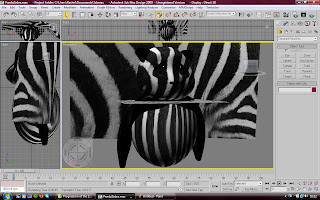
This is a rendered image showing the panda in full. I am happy with how the panda turned out because even though it has a zebra's texture, it still looks like a realistic panda.

The body was very hard to create. I had to make sure that it looked very similar to the way a panda is shaped. I created the main part of the body with a simple sphere and some texture using the material editor. The arms and shoulders were not so easy because they did not have a basic shape to them. I made one arm using a cylinder and the 'edit poly' modifier. I also used the 'soft selection' tool to make sure that they looked even. After I had spent a lot of time making one arm i used the 'symmetry' tool to create an exact replica on the other side of the body. I used the 'mirror' option to move it into the perfect position. I then used the material editor to put black fur texture on both the arms.

This is a rendered image showing the panda in full. I am happy with how the panda turned out because even though it has a zebra's texture, it still looks like a realistic panda.

Subscribe to:
Comments (Atom)


